
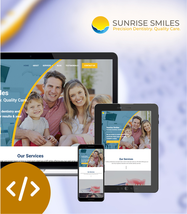
RESPONSIVE WEB DESIGN SERVICES
Elevate your digital presence with our best Responsive Website Design
Services and expertise!
WEB DESIGN
Responsive Web Design
In an era where online interactions span a multitude of devices, from smartphones to tablets to desktops, having a website that can elegantly adapt to these varying screens is no longer a luxury—it’s a necessity. Our affordable web design services is carefully crafted by our expert web designers to ensure that your online presence flourishes across every digital landscape.
We always keeps responsive web design at the forefront.
At Namami Inc, our approach to responsive web design goes beyond aesthetics – we focus on creating websites that seamlessly adapt to various screen sizes and devices. As a dedicated Responsive Web Design Company in Florida, we understand that a responsive website is the cornerstone of modern online success.
Why should you care about a web design that is multimedia friendly? Imagine a website that effortlessly transforms itself, like a chameleon, to fit the screen it’s displayed on. Whether your audience is browsing from a small smartphone during their daily commute or using a desktop computer to delve into intricate details, our responsive web design services ensures a consistent and captivating experience. Providing your visitors with the best possible experience and saving them from that exasperation will reflect positively on your ROI. At Namami, we not only recognize but go to every length to fulfill the needs of our clients.
We know how critical website visitors are for sales, brand loyalty, and reputation. So, we devise brilliant solutions while designing a responsive website for your business. Our designs respond beautifully to the user’s behavior based on orientation, screen size, and platform. The practice technically consists of a mix of flexible layouts and grids, intelligent use of CSS/CSS3 media queries along with images and illustrations. Just as the user switches from the laptop to the iPad, the website automatically switches to accommodate for resolution, scripting, and image size capacities. The result? A leading responsive web design and the flexibility to adapt quickly whenever a new gadget comes onto the market.
Connect With Us!
We save our clients $1,000’s on updates and extra tasks.
Another benefit that distinguishes Namami is that you have a team – not one sole person – so you always have dedicated people ready and waiting to assist you. Our goal is to be your long-term collaborative partner.
We’re focused on your success!

Are you interested in a little of the nitty-gritty? Responsive web development has three key elements: media queries, fluid grid, and flexible images. Semantic HTML (that works on any device), in conjunction with these three core elements, makes up the first step, and then advanced JavaScript and CSS are unobtrusively layered in — only for capable browsers. This formula becomes the foundation for the device-level optimization that responsive web design is all about, and also for building a jQuery mobile library.
As a dedicated responsive web design service provider, we understand that “one-size-fits-all” doesn’t apply to the digital realm. Our responsive website design services are tailored to suit your unique brand identity, ensuring that your message resonates harmoniously across all devices.
We all know there is no end to the emergence of new gadgets and devices, and those screen resolutions, definitions, and orientations vary. Thankfully, adaptive technology has kept up, allowing responsive web design and mobile app design experts the required flexibility. In a nutshell, the design comprises separate containers, each with flexible contents, or widgets, within. By creating all screen elements to be fluid and flexible, the modules inside easily resize to fit their containers. It is due to this flexibility that images can automatically adjust. With the help of workaround layouts, they never break (although substandard designs may become illegible or squished in the process). Although this is the extent of current technology, it is quite adaptable and ideal for devices that switch from portrait to landscape orientation instantly or for when users switch from a large desktop monitor to a smaller tablet screen.
Namami Inc.
We Will Surprise You Our Fees Are
Lower Than You Might Think.
Working with the entire team at Namami Inc. has been an outstanding experience for my company. In regards to
working on social media, business operations, and networking, they have brought both new ideas and concrete
results to the table – in a short amount of time and at a reasonable cost. They have also worked with timely
updates and communication, which is highly important to me.

Frequently Asked Questions!
Discover answers to common inquiries about our responsive web design services. Get the
information you need to make informed decisions for your website project.
What is responsive web design?
Responsive web design is a method of creating websites that adapt and appear good on all platforms, from smartphones and tablets to desktop PCs. It means your website’s layout and content will change to deliver the optimal user experience, regardless of screen size, making it more accessible and user-friendly for your audience.
Our responsive web design services include a number of important factors:
1. Fluidity: We use fluid grids to ensure that your content flows smoothly, making it accessible and visually appealing on screens of all sizes.
2. Media Optimization: Images and media are optimized to maintain quality and load quickly, regardless of the device’s capabilities.
3. Tailored Styling: We tailor the appearance and functionality of your website to different screen dimensions using CSS3 media queries. Fonts, spacing, and navigation are tailored to the situation.
4. Enhanced User Experience: We focus user experience in our responsive designs, which results in longer visitor durations, lower bounce rates, and higher engagement.
5. SEO Advantage: Search engines value responsive websites because they provide a constant user experience. This can help improve your search engine rankings.
When you hire Namami Inc. for responsive web design, you’re investing in a user-centric approach that ensures your website looks and operates beautifully across all devices. This not only improves your brand’s image but also broadens your audience reach.
Does you test responsive website on all devices?
A good ecommerce website design is a delicate balance of aesthetics and functionality. We believe that a winning design should have:
- User-Friendly Layout: An intuitive layout that makes navigation easy, ensuring customers can find products effortlessly.
- Visually Appealing: Visually appealing, high-quality images and a cohesive design that reflects your brand’s identity.
- Mobile Responsiveness: A design that’s mobile-responsive, providing a seamless shopping experience on all devices.
- Clear Product Presentation: Clear and compelling product listings with detailed descriptions and high-resolution images.
- Efficient Checkout: A streamlined and secure checkout process that minimizes friction for buyers.
- Robust Search Functionality: Effective search features that help users find products quickly.
- Trustworthy Design Elements: Trust signals, such as secure payment icons and customer reviews, to build trust and credibility.
- Fast Loading Times: Fast-loading pages to reduce bounce rates and keep users engaged.
- SEO Optimization: SEO-friendly design to improve search engine rankings and attract organic traffic.
- Scalability: Scalability to accommodate growth and changes in your product catalog.
A successful ecommerce website design combines these elements to create an enjoyable shopping experience for your customers, ultimately driving conversions and growth for your online store.
Does Google prefer responsive design?
Yes, Google strongly prefers responsive web design. This preference is driven by Google’s commitment to delivering a consistent and user-friendly experience for its users. Responsive design ensures that a website adapts seamlessly to various devices, maintaining a consistent URL structure and content across all screens. With the shift to mobile-first indexing, Google primarily uses the mobile version of a site for ranking and indexing, making responsive design essential for ensuring your site ranks well in search results.
Additionally, responsive design often results in faster load times, better user experiences, and reduced duplicate content issues—all factors that Google rewards with improved search rankings. By choosing our responsive web design service, you not only meet Google’s expectations but also enhance your site’s visibility and accessibility to a wider audience.
Does responsive web design cost more?
We understand that budget considerations are an important part of any web design project. When it comes to responsive web design, the question of cost is a common one. Let us clarify:
Responsive web design does involve some initial investment, as it requires specialized expertise and careful planning to ensure your website works flawlessly on all devices. However, it’s important to consider the long-term benefits and cost savings that responsive design brings:
1. One Website, Multiple Devices: Our Responsive design allows you to have a single website that adapts to different devices. This eliminates the need for separate mobile and desktop sites, resulting in lower ongoing maintenance and content management costs.
2. Improved User Experience: Our responsive website design gives a consistent and user-friendly experience, which can lead to increased engagement, longer visit durations, and potentially more conversions.
3. Future-Proofing: As new devices and screen sizes arrive, your responsive website will be better prepared to adapt without the need for a total redesign, saving you money in the long term.
While there is an initial investment in responsive web design, the long-term benefits, improved user experience, and potential cost savings make it a wise investment for businesses of all sizes.
Which is better responsive or adaptive web design?
We often encounter the question of whether responsive or adaptive web design is better. The truth is, both approaches have their merits, and the choice depends on your specific goals and requirements.
Responsive Web Design:
Responsive web design is a flexible approach that aims to create a single website that adapts fluidly to various screen sizes and devices. It offers several advantages:
- Cost-Efficiency: Responsive design typically involves lower upfront development costs since it focuses on a single design that adjusts to different devices. It also simplifies ongoing maintenance.
- SEO Benefits: Search engines favor responsive websites because they provide a consistent user experience. This can positively impact your search rankings.
- Future-Proofing: Responsive design is well-suited to the ever-evolving landscape of devices and screen sizes. It’s adaptable and can handle new devices without the need for a complete redesign.
Adaptive Web Design:
Adaptive web design, on the other hand, involves creating distinct layouts for specific device categories (e.g., mobile, tablet, desktop). Here are some reasons you might consider it:
- Optimized User Experience: Adaptive design allows for precise tailoring of the user experience on each device. This can be especially beneficial if you have unique content or functionality requirements for different screens.
- Performance Control: Adaptive design can offer more granular control over performance optimization, which can be crucial for resource-intensive websites or specific user interactions.
- Targeted Content: You can deliver content and features that are specifically tailored to the device, potentially improving user engagement and conversions.
So, which is better? It depends on your goals, budget, and the complexity of your project. In many cases, Responsive web design is an excellent choice due to its cost-efficiency, SEO advantages, and adaptability.
Why choose Namami Inc. for responsive web design services?
We understand that your online presence is crucial to your success, and responsive web design is at the heart of creating an impactful and user-friendly digital experience. When you choose Namami Inc. for your responsive web design needs, you benefit from our unwavering commitment to excellence.
- Expertise: Our team of experienced designers and developers are experts in the field of responsive web design. We stay at the forefront of industry trends and best practices to ensure your website not only looks stunning but also functions seamlessly across all devices.
- Tailored Solutions: We don’t believe in one-size-fits-all solutions. Every project is unique, and we take the time to understand your specific goals and audience to create a custom-tailored responsive design that aligns perfectly with your brand identity.
- Quality Assurance: Rigorous testing is at the core of our process. We meticulously assess your website on various devices, browsers, and screen sizes to guarantee flawless performance.
- Cost-Efficiency: Our responsive design approach not only ensures an exceptional user experience but also provides cost-efficiency by eliminating the need for separate mobile and desktop sites. We aim to deliver maximum value within your budget.
- SEO Focus: We optimize your responsive design for search engines, improving your site’s chances of ranking well in search results and driving organic traffic.
- Ongoing Support: Our commitment doesn’t end with the launch of your responsive website. We offer ongoing support and maintenance to keep your site up-to-date and performing at its best.
- Client-Centric Approach: Your satisfaction is our priority. We maintain transparent communication throughout the project, keeping you involved in every step of the design process.
Namami Inc.
Our Most Recent Works
We take pride in our work! Browse our portfolio and see our dedication to top-quality web
design in Boca Raton and beyond. Let’s discuss how we can help you!


Connect With Us &
Let Us Know How We Can Help!
"*" indicates required fields